Mobile SEO: How to optimize your site for any device?
You can't just focus on desktop users and expect to get away with it.
Let’s take a tour. You do a quick Google query and read a bunch of results. Then, you locate several websites that have the answer you’re looking for.
But the first, and most promising, website you select from the SERP doesn’t work properly on your favorite mobile device.
Content is king, but as we see here, it is not the only deciding factor. The device that displays the content also determines the user experience.
But since most websites are made on a PC, their owners often forget to optimize them for other devices.
Are you making the same mistake?
Check if your website is mobile-friendly >>>
Nowadays, almost everyone has a smartphone and uses it to search the Internet. You can’t just focus on desktop users and expect to get away with it. Make your site mobile-friendly if you want to ensure that fewer people abandon it.
The mobile device that displays your website also determines the user experience.
Your website looks great and works great on the PC – that’s fantastic.
Have you tried opening it on a smartphone?
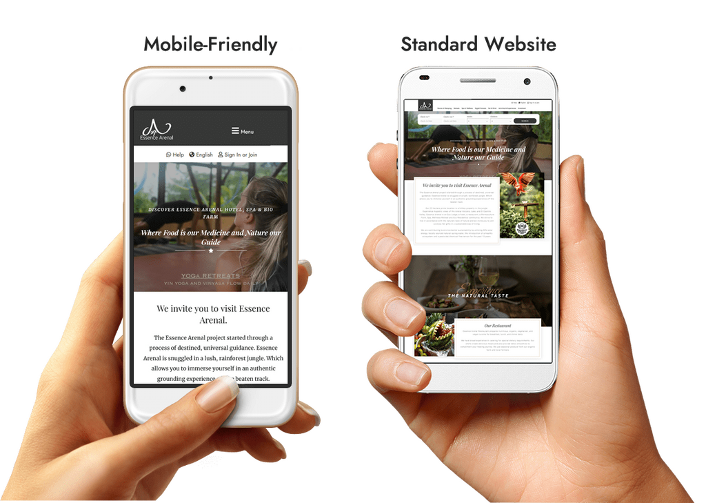
Does it look like this?

If so, then you have a big problem. That website is virtually unusable on mobile.
Unfortunately, just because a website is PC-friendly doesn’t mean it’s also mobile-friendly.
And because of Google’s mobile-first index, if your site is not mobile-friendly, it may never see the light of day on page 1 of the search engine results pages (SERPs).
What needs to be done?
The first important step in making your site mobile-friendly is to work on responsive design.
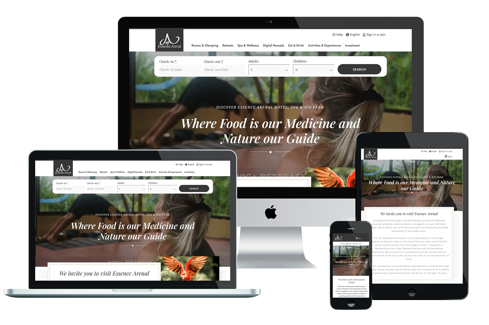
When a site is responsive, it displays correctly on screens of all sizes, like this one:

There are two ways to turn your website into a mobile-friendly experience. Each solution has its own advantages and disadvantages.
✓ The quickest way: install a dedicated like WPtouch to give your website a responsive design in a matter of minutes. It’s the simplest method, but it’s not without risk; plugins are prone to breakage and (in the most extreme cases) even hacking.
✓ The most reliable and secure way: modify your website code to include responsive solutions.
If you want to take matters into your own hands and transform your desktop website into a responsive and mobile-friendly website, you will need to incorporate:
We’ll show you all the code you need to make your website responsive. But first, make sure before you make changes to your code.
The graphic windows help each browser to know how to adapt the dimensions of your web page to its screen.
If you add a graphic window to the HTML code of your website, your pages will automatically adapt to any mobile device.
Add this:
To define the graphic window of a page, add this line of HTML code inside the <head> tag:
<meta name="viewport" content="width=device-width, initial-scale=1">
When it comes to mobile compatibility, it is important that the visitor does not have to scroll left and right to view your website content.
This also applies to all images, especially infographics.
Responsive images should automatically shrink and enlarge to fit perfectly to the width of each visitor’s screen.
Therefore, you should use the max-width property.
How to add the maximum width to make your images responsive
Opening your site’s stylesheet (the CSS file).
Add “max-width: 100%” for the <img> tag, like this:
					img {
 max-width: 100%;
}
Now, if your images are wider than the image window you added in the previous step, they will automatically shrink to fit the available space.
When you have a responsive design on your website, the page elements adapt themselves to any screen. For example, if you have a fluid table, the table will resize with the screen. This way, you can see all the columns without having to scroll left or right, even on a small mobile screen.
There are several fluid layout methods you can try, depending on your website:
Use them when appropriate.
When to use Flexbox
Use this method when you have several elements of different sizes and you want to fit them in a row. Add the “display: flex” property to your HTML tag, as in this example:
					.items {
  display: flex;
}
When to use Multicol
This method divides your content into columns. It uses the column count property, like this:
					.container {
 column-count: 3;
}
In this example, three columns are obtained.
When using the square grid
As the name implies, this method creates a grid into which to fit your elements. Here is an example:
					.container {
     display: grid;
     grid-template-columns: 1fr 1fr 1fr;
}
The grid-template-columns property sets the number of column tracks (three in this example) and their sizes (1 fr).
Still not sure which one to use? you can automatically detect and implement the best fluid layout.
Media queries are another way to adapt your content to any screen size. But they have another, much more notable advantage: they adapt your site to specific features specific to different devices.
For example, a computer mouse cursor can hover over page elements, and smartphones have touch screens. By taking these features into account, you can tailor the user experience to any type of device.
There’s a lot to take in when it comes to media queries, but MDN Web Docs has very detailed instructions.
Once you’ve done everything, see how well it works by viewing your site on many different devices.
The first step covered the technical framework that makes your website adapt well to mobile devices.
Good news: that was the hardest part. There are only a few more steps to go.
With a responsive design, your site is almost completely mobile-friendly. What else do you need to finish the job?
Next is
Pop-up windows make it difficult for visitors to get the information they are looking for and cause high bounce rates, that is, people abandon the site as soon as they enter it.
Now, some types of pop-ups are quite important. Most websites need to use cookies, and yours is probably no exception. And GDPR made it mandatory to ask users’ permission to use their data, so you can’t avoid using a popup for that.

However, your users do not visit your site to see pop-ups. When the entire page is blocked by an application, visitors may not be so willing to put themselves in its place. On the contrary, it is guaranteed to annoy them, and they may even leave without browsing your site at all.
What to do instead
Users tolerate pop-ups better when they take up a small portion of the screen. And if they are easy to close and dismiss, even better.
Even the slightest hiccup will be easy to spot on a small screen, including the dreaded 404 errors.
While a 404 page with a fun design may be useful to you, an error is still an error; it will disrupt the user experience. It is better to eliminate them altogether as a factor
How to spot technical errors on your website
What other errors can ruin a mobile user’s day? To name a few:
All of them will make the user run away if you don’t do something.
Fix all the website errors you find as fast as you can.
Don’t let codes like “Status: 503” confuse you: here are some expert tips on how to fix them.
Then get in the habit of scanning your site regularly (once a week is fine) and fix errors in a timely manner.
You visit your site and it takes too long to load. Oh no!
The Internet is down, isn’t it? Unfortunately, now your user may decide that your site is down and never come back.
That’s why it’s important to do everything in your power to make sure your site loads quickly at all times.
Follow these six tips to make your website load faster:
Smartphones are easy to carry around, making them a perfect tool for surfing the Internet on the go.
Does the user need to find something nearby? Your target is just a question away.
And since the question is likely to contain the word “where,” your website needs to be prepared for it. That’s achieved by optimizing for local search and, combined with mobile SEO, is surprisingly effective for voice search at the same time.
Simply do the following
Ideally, you should be able to captivate the visitor as soon as they see your website. But on a small screen, you can’t see everything you want to see. So what do you do?
Make the “above the fold” part of your site (what users see on the first scroll) a real stunner.
What are the must-have elements you should put there?
But that’s just the basics.
Here are a couple of ideas for experts:
Mobile SEO: How to optimize your site for any device.
As the saying goes, the best place to hide secrets is on page 2 of Google.
However, this is only true for the desktop version.
Google for mobile comes with infinite scrolling, which presents the first 40 results instead of 10 before you find the “See more” button.
However, first 10 results or not, your search results will never get clicks if they don’t stand out.
And, as with anything else, you need to stand out well. How do you apply this principle to your search results?
There are three great ways to make your search results more interesting to your future visitor:
Mobile SEO: How to optimize your site for any device
Years ago, Google saw the potential of mobile devices, and it turns out it was absolutely right.
The search giant invested heavily in mobile usability, and there’s no doubt about it: the Internet is much better because of it. Online content is now much more pleasing to the eye and easier to use.
But is your website up to the task, and are users getting the same experience on all their devices?
If you have even the slightest doubt, it’s time to use all the tools at your disposal to make sure your site meets the requirements.
Start improving your search rankings and user engagement with a responsive website today.
Do not forget to choose the best hosting from the OpenZone hosting platform. Get 24/7 support of our team. Our enhanced infrastructure focuses on auto-scaling, performance and security.
Let us show you the difference! Take a look at our plans!